Most people can recognize it instantly.
Whether they’re walking through a grocery store in New York, grabbing a snack in Tokyo, or shopping in a small market somewhere in Europe, one glance is usually all it takes.
A bright golden circle.
A sweeping red ribbon.
A familiar name stretched across the center.
The Lay’s logo has become so deeply embedded in everyday life that most people hardly think about it anymore. Yet behind that simple design lies a fascinating story of ambition, innovation, psychology, and nearly a century of brand evolution.
What appears to be a cheerful logo on a bag of potato chips is actually the result of decades of careful planning and marketing brilliance. Every color, shape, and curve serves a purpose. Every element was designed to create an emotional connection that extends far beyond the product itself.
The story begins in 1932.
America was in the midst of the Great Depression when a young entrepreneur named Herman Lay decided to take a chance on a growing snack-food business. Armed with determination and a strong work ethic, he began selling potato chips throughout the southern United States.
In those early days, there were no massive advertising campaigns or global distribution networks.
There was simply Herman Lay, his products, and his belief that quality and customer trust could build something extraordinary.
He delivered chips directly to stores, often transporting them himself. He learned quickly that selling snacks wasn’t just about taste—it was about creating familiarity. Customers needed something they could recognize and trust.
Without realizing it, Herman Lay was laying the foundation for one of the most successful food brands in history.
As the years passed, the company expanded rapidly.
Families embraced the product.
Retailers stocked more shelves.
Demand continued to grow.
But growth created a new challenge.
How could the company maintain a recognizable identity as it reached larger audiences?
The answer would eventually come through branding.
By the early 1960s, Lay’s had become a major force in the snack industry. Then came a pivotal moment that would forever change the company’s future.
In 1961, Lay’s merged with the Frito Company, creating Frito-Lay.
The merger combined two highly successful snack brands into a single powerhouse. Later, Frito-Lay became part of PepsiCo, giving the company access to one of the world’s most powerful marketing and distribution networks.
As the business evolved, so did its visual identity.
Early Lay’s logos were relatively simple.
They focused mainly on the company name.
Functional.
Straightforward.
Effective for their time.
But as competition increased and branding became more sophisticated, designers understood that the logo needed to communicate something more than just a name.
It needed personality.
Emotion.
Energy.
The transformation eventually led to the design millions recognize today.
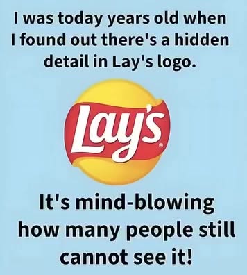
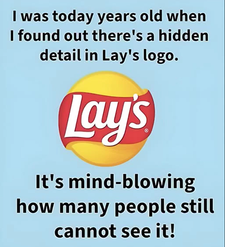
At the heart of the logo sits the famous golden-yellow circle.
To many people, it simply looks cheerful.
But its symbolism runs deeper.
The circular shape subtly echoes the sun, representing warmth, positivity, and optimism. It also creates a sense of familiarity and comfort, feelings that consumers naturally associate with enjoyable experiences.
Psychologists have long understood the power of color in influencing human emotions.
Yellow is often connected with happiness, friendliness, and energy.
It captures attention without appearing aggressive.
When consumers glance at a crowded shelf, the bright yellow immediately stands out.
Then comes the red ribbon.
Flowing across the circle, it introduces movement and excitement.
Unlike the calm warmth of yellow, red creates urgency and stimulation.
It’s one of the most powerful colors in marketing because it naturally draws the eye.
More importantly for food brands, studies have repeatedly shown that red can stimulate appetite.
The combination of yellow and red isn’t accidental.
It’s one of the most effective color pairings in consumer branding.
Together they create a feeling that is energetic, welcoming, and impossible to ignore.
But color alone isn’t enough.
The typography plays an equally important role.
Look closely at the Lay’s lettering.
The curves are soft.
The edges are rounded.
Nothing feels rigid or formal.
Instead, the design feels approachable.
Friendly.
Almost playful.
The letters seem to flow naturally with the red ribbon beneath them, creating a sense of movement that mirrors the fun and casual nature of snacking itself.
This subtle design choice helps communicate an important message.
Lay’s isn’t selling luxury.
It isn’t selling exclusivity.
It’s selling enjoyment.
A simple pleasure meant to be shared by everyone.
Over time, the logo underwent multiple refinements.
Designers adjusted spacing.
Enhanced color contrast.
Improved readability.
Modernized typography.
Yet they always preserved the core elements that consumers had come to recognize.
This balance between evolution and consistency became one of Lay’s greatest strengths.
Many brands struggle when redesigning logos.
Change too much and customers no longer recognize the brand.
Change too little and the brand risks appearing outdated.
Lay’s managed to navigate this challenge remarkably well.
Each update felt familiar while still appearing fresh.
That consistency helped transform the logo into something much larger than a corporate symbol.
It became a cultural icon.
Today, the Lay’s logo appears in more than 100 countries.
Different regions may offer unique flavors tailored to local tastes, but the familiar logo remains largely unchanged.
Whether it’s a barbecue flavor in America, a seafood variation in Asia, or a regional specialty in Europe, consumers immediately know what they’re looking at.
That level of global recognition is extraordinarily rare.
Few logos possess the ability to transcend language barriers and cultural differences so effectively.
The logo’s success also highlights a broader truth about branding.
Great logos don’t simply identify products.
They create emotional associations.
When people see the Lay’s logo, they often think about more than potato chips.
They think about family gatherings.
Movie nights.
Road trips.
Parties.
Picnics.
Everyday moments of enjoyment.
The logo has become attached to experiences, memories, and emotions accumulated over decades.
That emotional connection may be the most valuable asset any brand can possess.
What makes the Lay’s logo especially impressive is its simplicity.
There are no complicated graphics.
No elaborate illustrations.
Just a circle, a ribbon, and a name.
Yet those few elements communicate nearly a century of history, trust, and consumer loyalty.
That simplicity is precisely what gives the design its power.
The next time you pick up a bag of Lay’s chips, take a moment to look beyond the packaging.
Notice the golden circle.
The vibrant red ribbon.
The welcoming typography.
Together, they tell the story of a small business started by an ambitious entrepreneur in Tennessee that grew into one of the world’s most recognizable brands.
More importantly, they demonstrate how thoughtful design can shape perception, build trust, and create lasting emotional connections across generations.
The Lay’s logo isn’t merely a decoration printed on a snack bag.
It’s the visual embodiment of nearly a hundred years of innovation, marketing brilliance, and consumer loyalty.
And in a world filled with countless competing brands, that’s exactly what makes it unforgettable.


