The 7-Eleven logo is one of the most familiar and recognizable brand symbols in the world. Its bold combination of red, orange, green, and white has appeared on storefronts in busy cities, suburban neighborhoods, gas stations, and roadside stops for decades. For many people, the sign instantly brings to mind quick snacks, cold drinks, coffee, late-night errands, and the convenience of being able to find everyday items almost anytime they are needed.
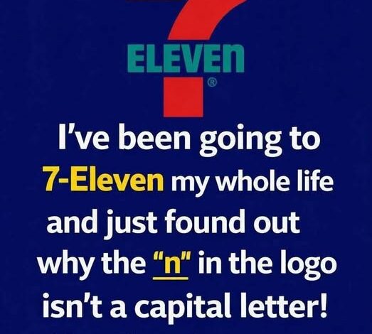
At first glance, the logo seems simple. It features a large number “7,” the word “Eleven,” and a bright color palette designed to catch the eye. But when people look more closely, they often notice a small and unusual detail. In the word “Eleven,” the final letter is written as a lowercase “n,” while the rest of the letters appear in uppercase style.
This tiny design choice has puzzled customers, designers, and curious observers for years. Some assume it was a printing mistake that somehow survived over time. Others believe it may have a hidden meaning or secret message. In reality, the lowercase “n” is widely understood as a deliberate branding decision, one connected to the company’s history, visual identity, and desire to make the logo feel less harsh and more approachable.
To understand why such a small detail matters, it helps to look at how 7-Eleven began and how its brand identity developed over the years.
Before 7-Eleven became a global convenience store giant, it started as a much smaller business in Dallas, Texas. Its history dates back to 1927, when the company operated under the name Tote’m Stores. The name came from the idea that customers could “tote” away the goods they needed from a convenient local shop.
At the time, this was a practical and forward-thinking idea. Grocery shopping was often more limited and less convenient than it is today. Customers might have needed to visit different stores for different basic items. Tote’m Stores offered products such as milk, bread, eggs, and other everyday necessities in one accessible place. This focus on saving customers time would eventually become one of the most important parts of the company’s identity.
The early stores were built around a simple promise: make daily life easier. That idea may seem ordinary now, but it helped shape the modern convenience store model. The company was not just selling groceries. It was selling accessibility, speed, and practicality.
A major turning point came in 1946, when the company changed its name to 7-Eleven. The new name was chosen to highlight the stores’ extended operating hours. At a time when many retail and grocery stores closed much earlier in the evening, these locations stayed open from 7 a.m. until 11 p.m.
Those hours were unusual and memorable. They gave customers more flexibility and helped separate the company from traditional stores. The name 7-Eleven was direct, easy to remember, and closely tied to what made the business different. It told customers exactly why the store was useful: it was open earlier and later than many other places.
As the new name gained popularity, the company needed a strong visual identity to match it. The logo had to be bold enough to stand out from a distance and simple enough to be recognized quickly. This was especially important for a business built around convenience. Customers passing by in cars or walking through busy streets needed to spot the store immediately.
The large number “7” became the central feature of the logo. It was strong, memorable, and directly connected to the brand name. The word “Eleven” completed the identity, reinforcing the store’s original operating hours and making the sign easy to read. The bright red, orange, and green colors helped the logo stand out on storefronts and signs, especially in crowded commercial areas.
Over time, the logo became more than just a sign. It became a symbol of quick access and everyday reliability. Whether someone needed coffee before work, a snack during a road trip, or a late-night item after most stores had closed, the 7-Eleven sign became associated with availability and convenience.
Interestingly, while the name 7-Eleven originally referred to store hours from 7 a.m. to 11 p.m., the company later moved beyond that schedule. In the early 1960s, some stores began staying open 24 hours a day. One well-known example involved a store in Austin, Texas, that remained open late during a busy football weekend because customer demand was high.
The decision proved successful. Customers responded positively, and the longer hours brought in more business. Gradually, more stores began adopting extended schedules, and many eventually became open around the clock. This helped strengthen 7-Eleven’s image as a place customers could rely on at almost any hour.
Even after 24-hour service became common, the company kept the name 7-Eleven. By then, the name had become too recognizable and valuable to change. It no longer functioned only as a description of store hours. It had become a brand identity of its own.
One of the most talked-about parts of that identity is the lowercase “n” in the logo. The rest of the word “Eleven” appears bold and uppercase, but the final letter breaks the pattern. This small choice gives the logo a slightly softer and more distinctive look.
According to popular accounts of the logo’s history, early versions used all capital letters. While that approach made the word strong and visible, it may have also made the design feel too rigid or severe. The wife of company president Joe C. Thompson Jr. is often credited with suggesting that the final letter be changed to lowercase. Her reasoning was that the lowercase “n” would make the logo feel more graceful, friendly, and balanced.
That small adjustment changed the tone of the design. Instead of looking overly stiff, the wordmark became slightly warmer and more inviting. The lowercase “n” softened the overall appearance without making the logo less readable. It also gave the brand a unique visual detail that helped distinguish it from more standard corporate lettering.
There does not appear to be a deeper secret meaning behind the lowercase “n.” It is not believed to represent a hidden code or symbolic message. Rather, it is an example of how thoughtful design can influence the way people perceive a brand. A single letter, changed in a subtle way, can affect the mood of an entire logo.
This is why small design choices matter so much in branding. Logos are not only about words and colors. They communicate personality. A fully uppercase wordmark can feel powerful, direct, and authoritative, but it can also feel cold or aggressive depending on the design. A small lowercase detail can make a brand feel more human, casual, or approachable.
For 7-Eleven, the lowercase “n” helped create a balance. The logo still feels bold and easy to recognize, but it does not feel overly formal. That balance fits the company’s purpose. A convenience store needs to be visible and efficient, but it also needs to feel welcoming to everyday customers.
The logo’s consistency has also played a major role in its success. While 7-Eleven has made updates to its branding over the years, the main elements have remained largely familiar: the large “7,” the bright color scheme, and the distinctive lettering. This consistency has helped the brand remain recognizable across different countries, cultures, and generations.
In branding, familiarity builds trust. When customers see the 7-Eleven logo, they know what kind of experience to expect. The store may be in a different city or even a different country, but the logo communicates the same basic promise: convenience, speed, and accessibility.
Today, 7-Eleven is more than a convenience store chain. It is a global retail symbol. Its logo represents decades of business evolution, from a small Texas operation called Tote’m Stores to one of the most recognizable convenience brands in the world. The design reflects the company’s history, its focus on customer needs, and its ability to adapt while still preserving a strong identity.
The lowercase “n” may seem like a small detail, but it is part of what makes the logo memorable. It shows that branding is often shaped not only by big decisions, but also by subtle choices that affect how people feel when they see a name, sign, or symbol.
In the end, the story of the 7-Eleven logo is a reminder that successful design does not always depend on complexity. Sometimes, the most lasting brand details are the quietest ones. A single lowercase letter can soften a bold logo, create curiosity, and become part of a company’s visual legacy.
What began as a practical store name based on operating hours eventually became a worldwide symbol of convenience. And hidden in plain sight, the lowercase “n” continues to show how even the smallest design decision can leave a lasting impression.